Busena Terrace
Branding + Packaging
Busena Terrace is a 5-star hotel on the coast of Okinawa, Japan. The identity represents a mixture of traditional Japanese tradition and the sleekness and sophistication of contemporary design. For the monogram, the "B" is created with a Japanese-style, thick typeface and the "T" is created with a thinner, minimalistic san serif typeface. The wave symbol incorporated on the "T" of the monogram represents what the hotel is most known for, its beach-front location and thrilling, aquatic activities.
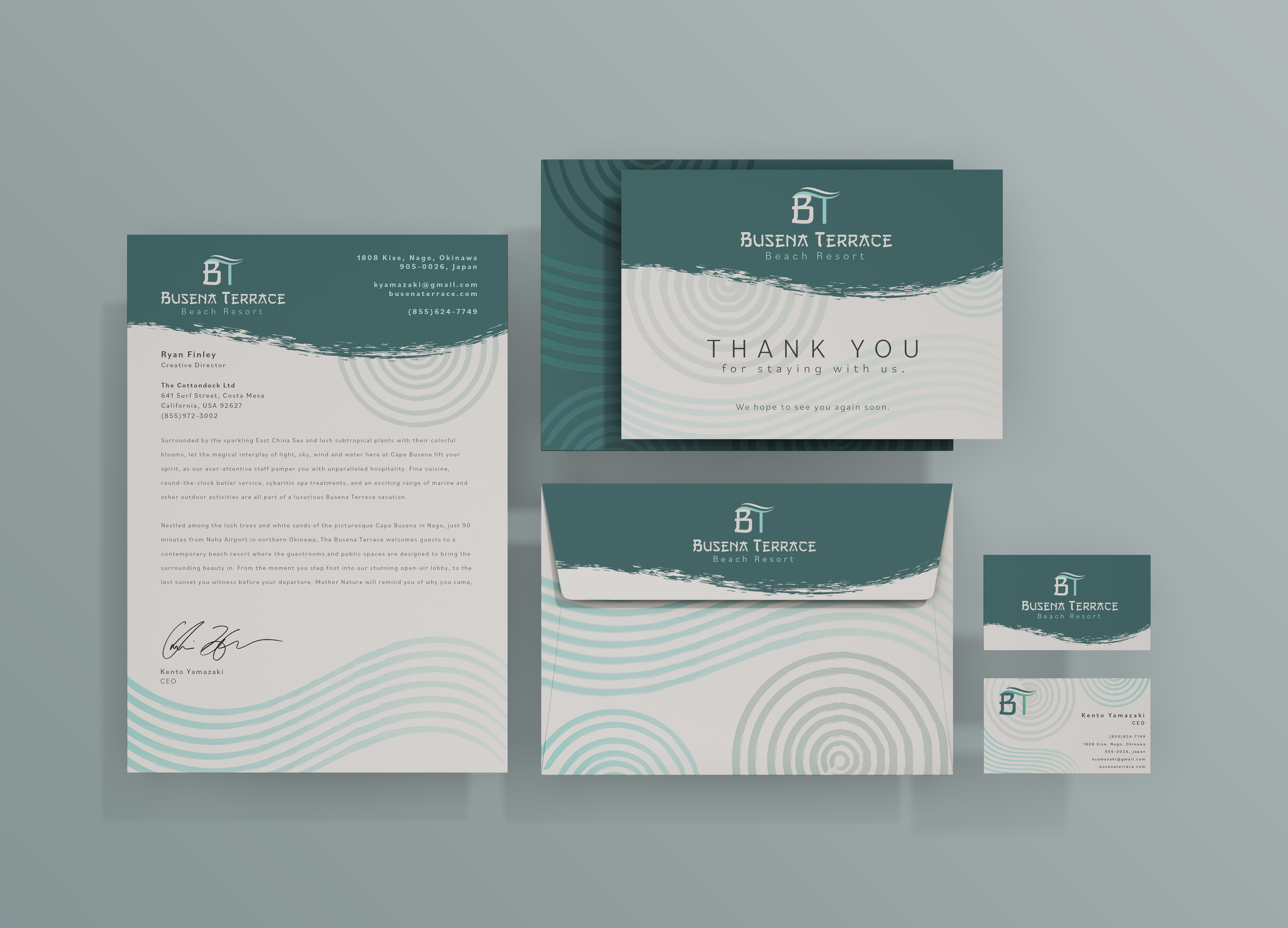
The color palette is a light tan to represent the sand of their beaches, dark teal to represent their tropical waters, and a dark grey to tie in the traditional Japanese aesthetic of ink/watercolor art. The patterns throughout the system represent the Japanese tradition of zen gardens and they mimic the designs raked in the sands of the garden. Also, the zen patterns are done in a watercolor style to once again, highlight traditional Japanese art. The color palette is a light tan to represent the sand of their beaches, dark teal to represent their tropical waters, and a dark grey to tie in the traditional Japanese aesthetic of ink/watercolor art. The patterns throughout the system represent the Japanese tradition of zen gardens and they mimic the designs raked in the sands of the garden. Also, the zen patterns are done in a watercolor style to once again, highlight traditional Japanese art.
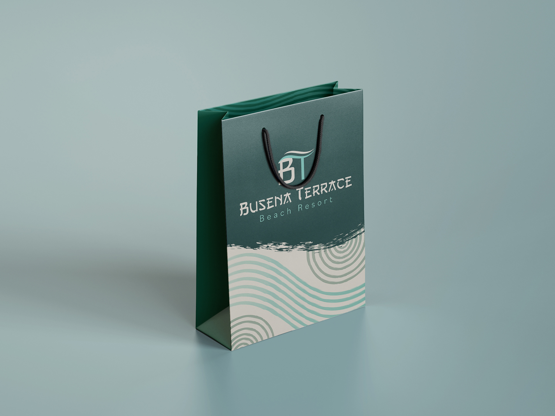
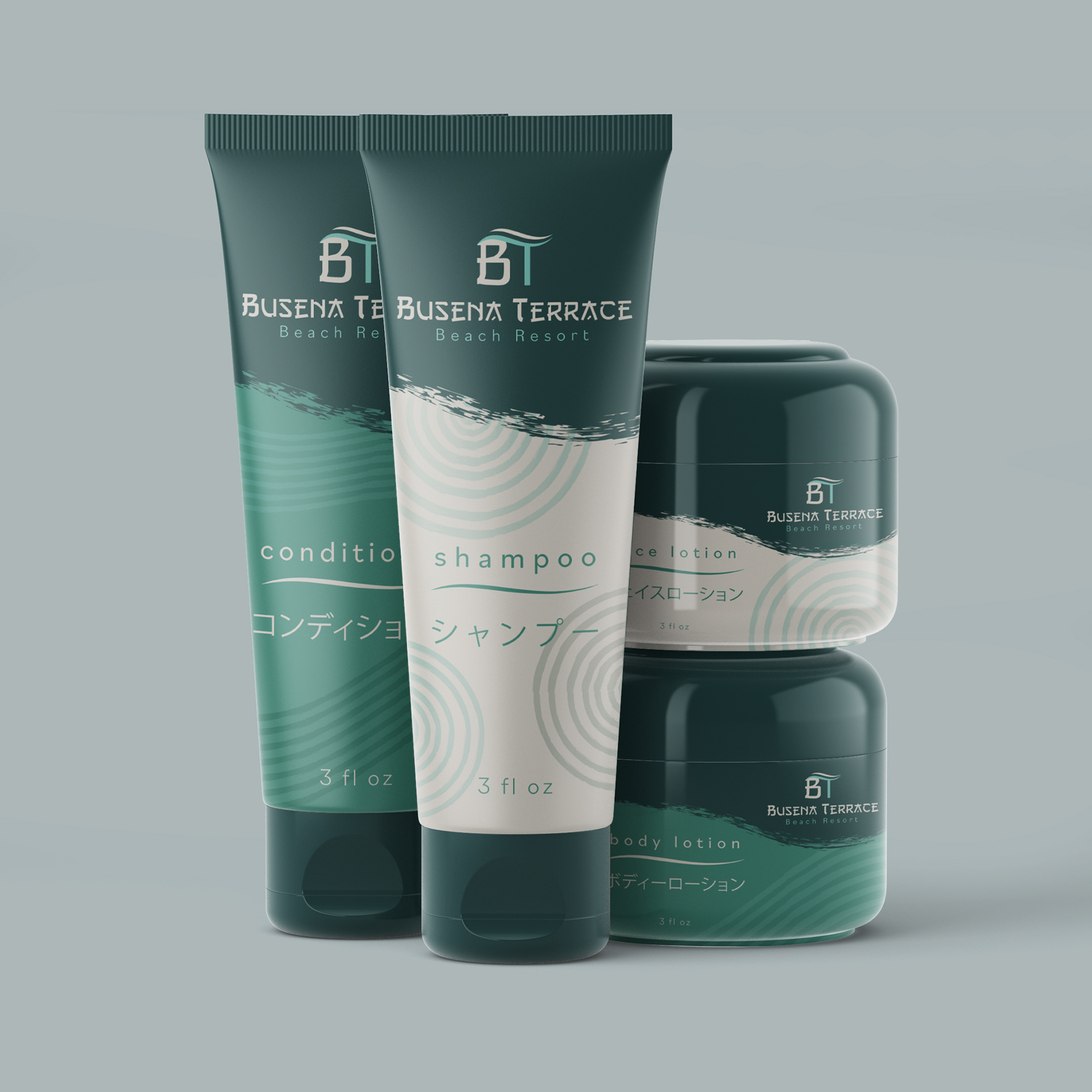
What's added to the toiletry tubes is the Japanese translation for specifications of the contents. To create a sleek design for the gift bag, I included minimal patterns on the front of the bag and kept the side blank with only the dark teal background to keep the modern feel. However, the inside of the bag carries on the zen patterns.